Branding/Design Client Case Studies


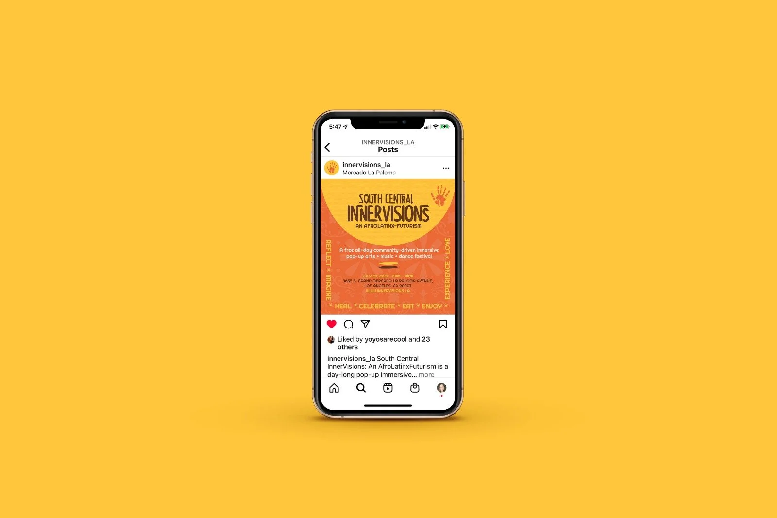
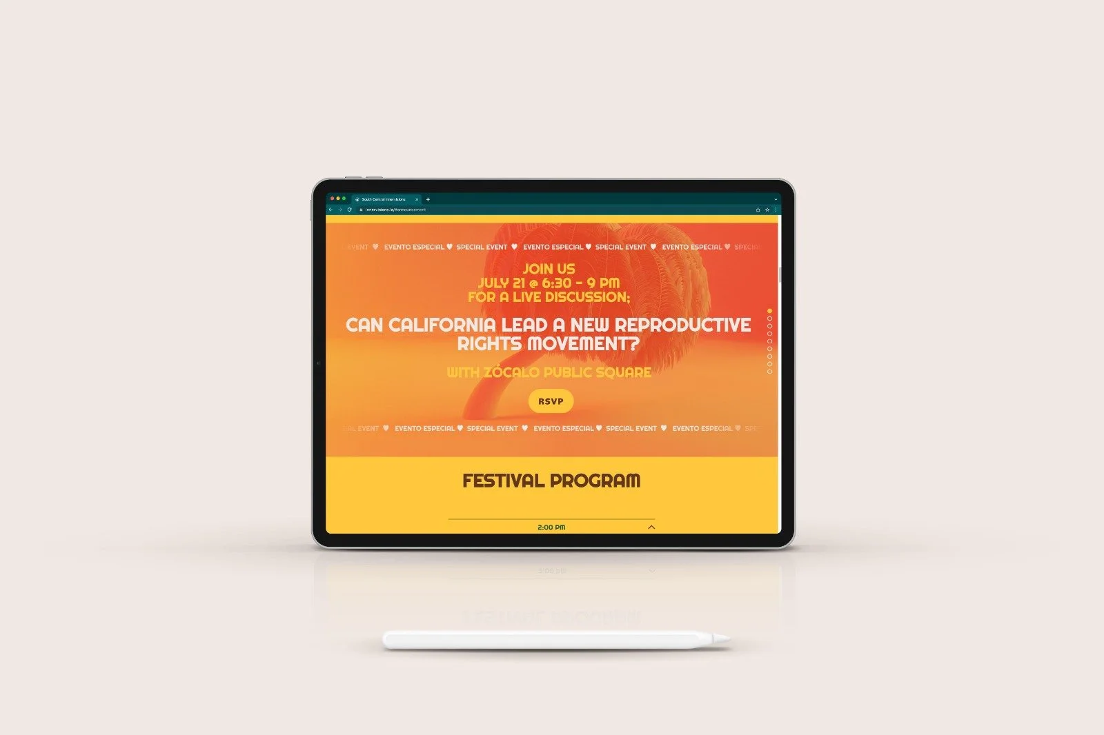


SOUTH CENTRAL INNERVISIONS: AN AFROlatinx-futurism
A collaborative project for a daylong pop-up immersive multidisciplinary arts festival curated to interpret & reflect upon the historical and future relational nature of Black & Brown power and explore the Black/Latinx imagination. The graphic exploration included creating patterns from textiles and cultural items of the Afro and Latinx cultures within a vibrant tropical environment.
Event Branding: typographic curation, color palette, custom graphics, and patterns.
Event Materials Designed: Banners, Step-and-Repeat backdrops, Posters, Postcards, Programs, Stickers, Social Media Graphics, and Website.
_This project is a part of Co-Lab with I.M., Carolina

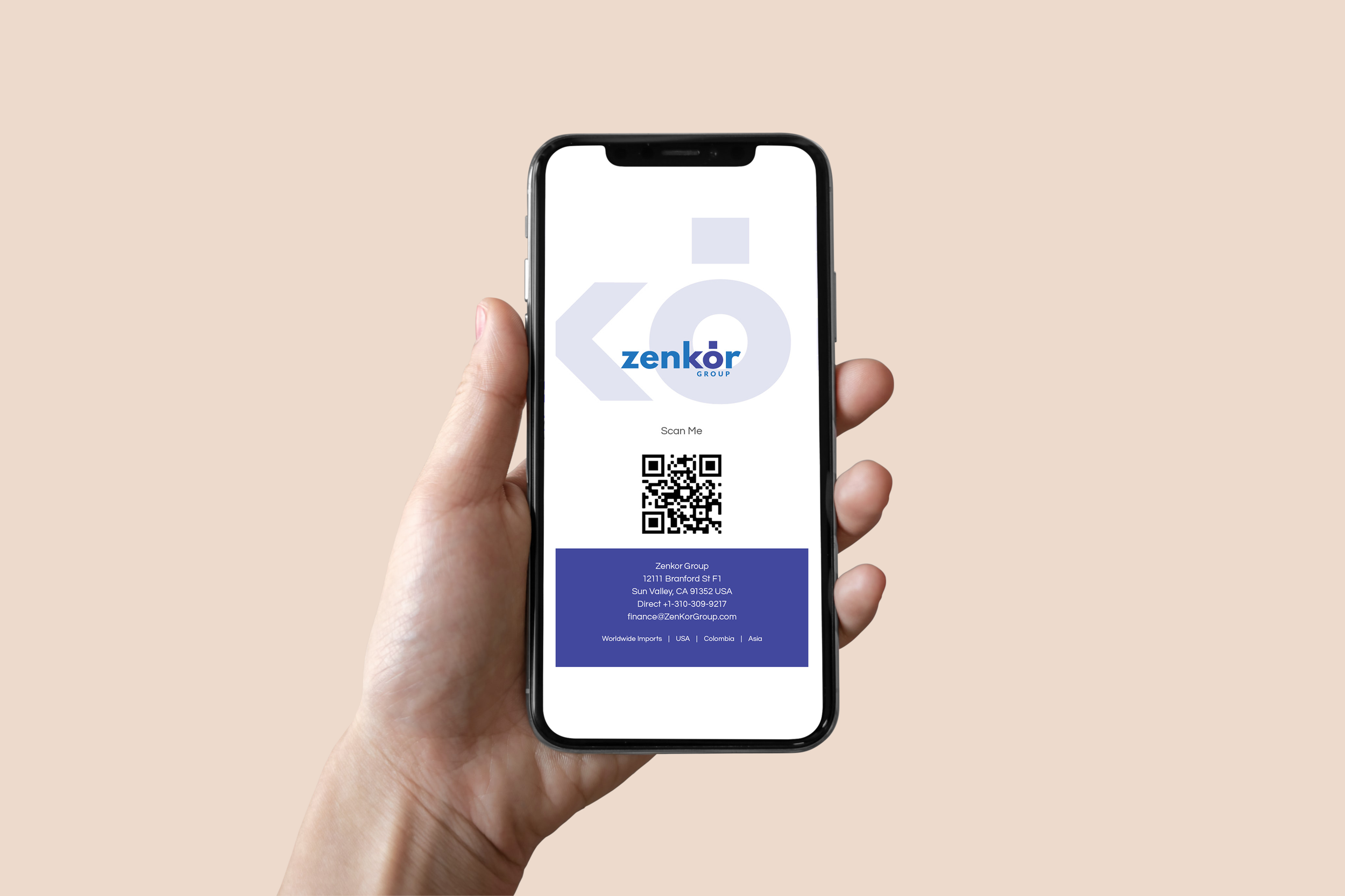
Digital Business Card
Senkor group IDENTITY
For this identity, I explored with the shapes of cargo ships to create a brand that represents shipping and exporting.
CROP COLLECTIVE IDENTITY
For this identity, Crop Marks where included at the top to resemble the designer’s collective workspace and their design process. Crop Collective Designers start in the outside world beyond crop marks, margins, and grids to provide the most authentic visual solutions.

FORM 4 ARCHITECTURE CONTEST
As Crop Collective we were part of a contest to design Form Four Architecture website. On our presentation we provided a couple of identity sketches. We did not make the cut but I believe it is important to show the work that did not make it as well! In this identity sketch duality is shown in terms of language. I experimented with all the possibilities of connecting these two words together into one.


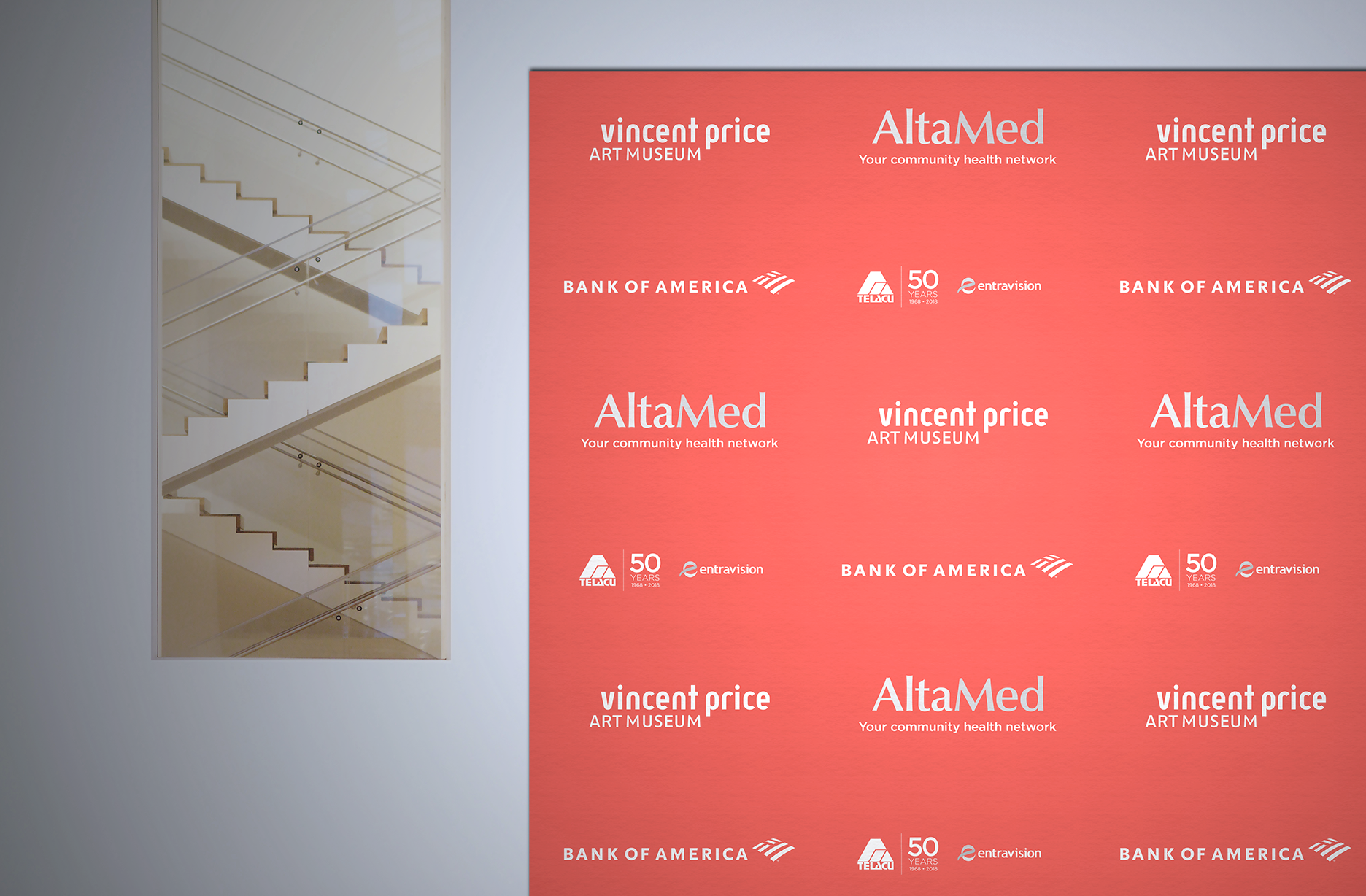
East LA College & Vincent Price Art Museum
Fundraiser Branding
Design associated with the first East Los Angeles College & Vincent Price Art Museum's joint Gala.
This project involved visually merging two distinct institutions with their respective styles: East Los Angeles College (traditional) & Vincent Price Art Museum (contemporary). Our typographic experimentations fused serif and san-serif typefaces to represent each of the institutions values and visual styles. A Spring palette inspired the selected colors and gradient approach - serving as both a literal and figurative representation of transformation.
The design included the Save the Date promotional materials, printed invitations, donor cards, auction catalogue, event signage, presentation, and program book that features articles on honoraries: Ernest Camacho, Kevin De León, Deborah Marrow, and John Valadez.
Collaboration project with _I Crop Collective.


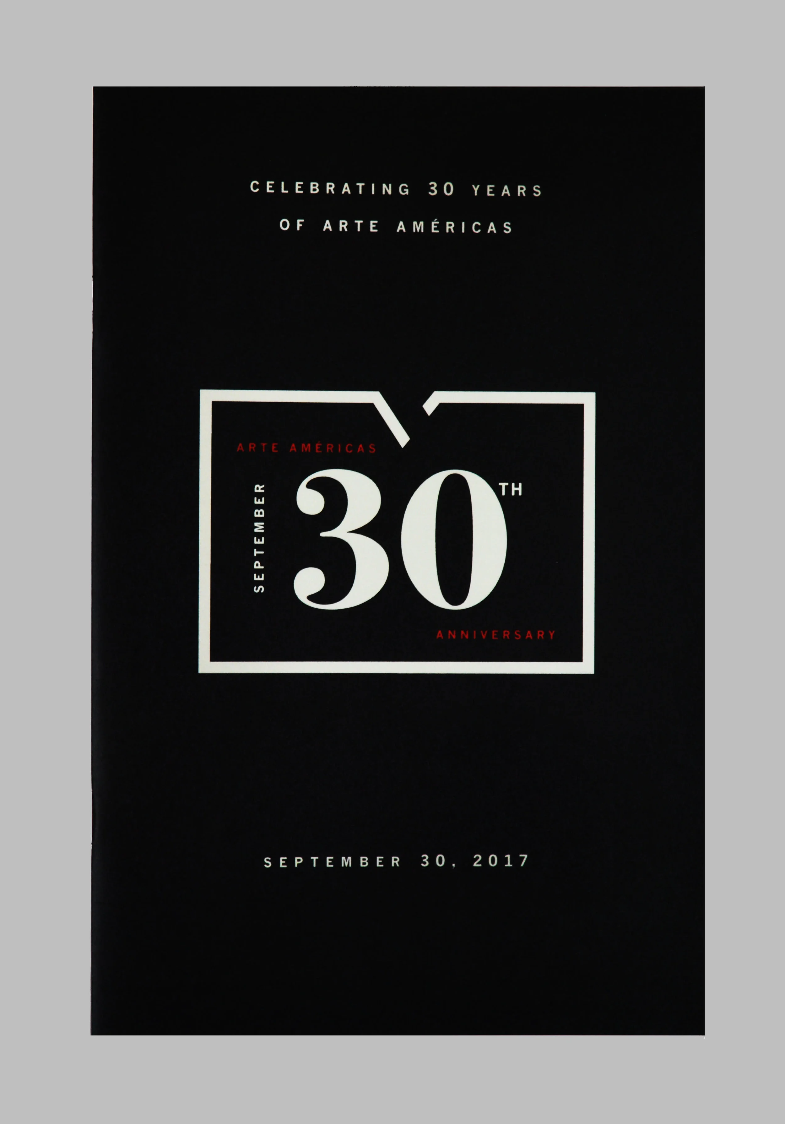

Arte Américas
Event Branding & Collaterals
The event logo presented in two variations (light and dark) cohesively and simultaneously bring together the theme of the event, "Arte Arte Americas 30th Anniversary" with the actual date of the event "September 30th." This typographic treatment elevates the event as a whole, providing the visual foundation for the non-profit museum to secure further financial support through its sponsors and contributors.
Strategic branding applied throughout all event collaterals.
Collaboration Project with _I Crop Collective


Vincent prize museum
Event Branding & Collaterals
We worked together with the client to create a contemporary and fresh approach for the Vincent Price Art Museum’s Spring Gala (2019) event. Materials designed included: step-and-repeat backdrop design, signage, presentation, uniquely designed envelopes and printed invitations. The gala was a huge success with a reported sold-out attendance by L.A.’s best art community.
Strategic branding applied throughout all event collaterals.
Collaboration Project with _I Crop Collective


JULIEVETT.COM
BLOG BRANDING + SQUARESPACE WEBSITE
I worked closely with the client to bring a safe space concept branding that is approachable, humble, minimal, and conscious. For this brand, I dug deep into the research of how the Monstera plant survives to find a graphic to represent the safe space my client asked for. One of Monstera’s survival elements lies within their holes, hence providing that safe space. I added one essential element needed for the plant’s survival: The sun. Embracing the whole concept, we can find the plant moving in the direction of a clock: the clock of life. All of these elements together represent my client’s theme for her blog: A safe space created to empower women and a guide toward a more conscious lifestyle including vegan recipes, yoga, life coaching, and more.
Strategic branding applied throughout all blog collaterals.