Carmela
A living illustration of pain, healing, and becoming
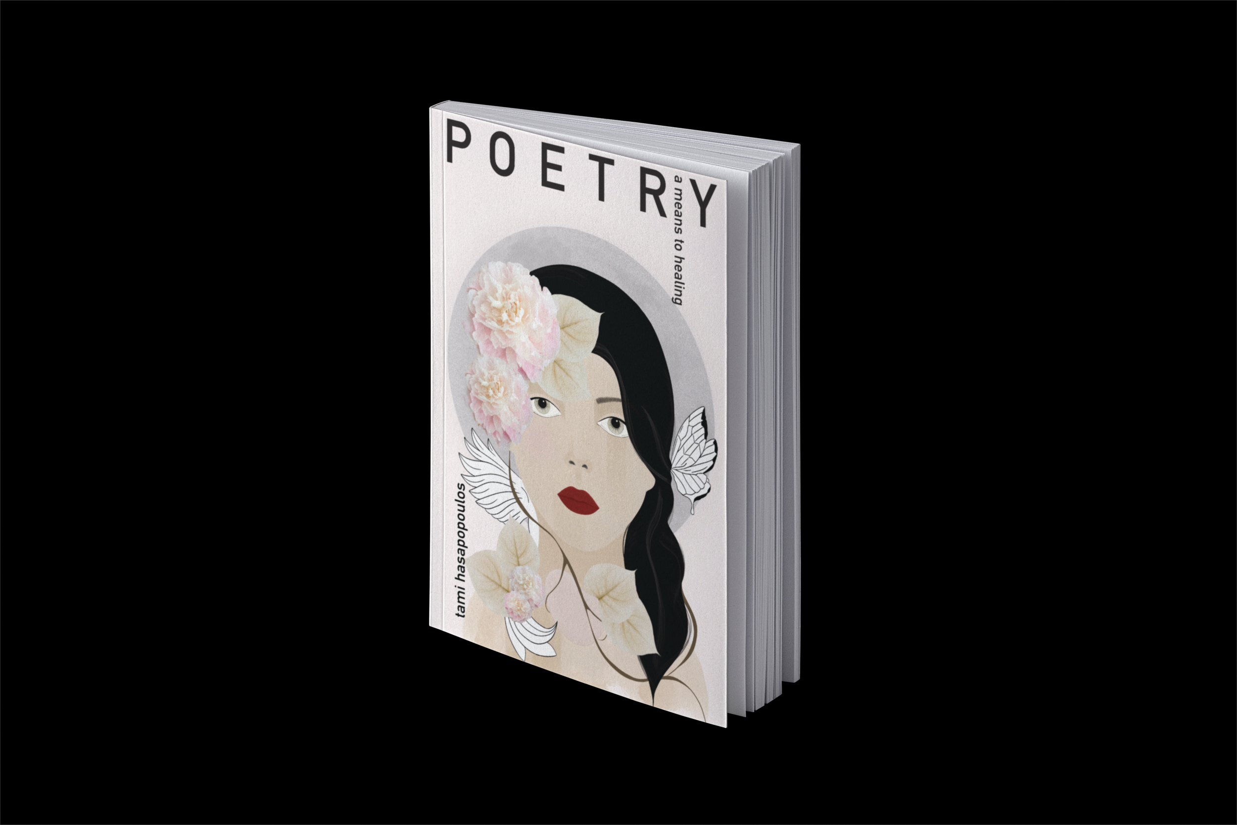
Book Cover Mockup (Final Design)
Some projects arrive quietly, yet they change us forever.
Carmela was one of those.
Now, seeing her in print, I know with certainty that she was never meant to exist as only a book cover or a drawing. From the very beginning, she existed somewhere between my client’s inner world and my own. A shared space where memory, intuition, and spirit met. Carmela lives there still. She breathes. She teaches. She heals.
The mission of this project was to visually hold a woman’s pain through the lens of spiritual healing. Resilience, stoicism, and transformation guided every decision. The author wished for the cover to embody the elements of her lived experience, not as something heavy or confronting, but as an invitation. A soft pull inward. A quiet promise that light exists within the pages.
This book speaks to healing from covert abuse. It does so with compassion, clarity, and hope. The cover needed to reflect that same energy. A visual threshold where the reader could feel held before even turning the first page.
Carmela began with a single conversation.
There was no rush. Ideas unfolded slowly, intuitively. Research blended with feeling. Listening became just as important as sketching. Carmela was inspired by the author’s grandmother, a woman she deeply admired. That reverence lives in Carmela’s posture, in her gaze, in her quiet strength.
My first sketches were born in nature, at Descanso Gardens, in La Cañada Flintridge in Los Angeles County, California. In the Japanese garden, surrounded by water, stillness, and living beauty, I felt something connect. There was magic there. A sense of spirituality that cannot be forced or replicated. Carmela revealed herself in that space, guided by Mother Nature, as I sat quietly in a small garden nook. It was a deeply intentional and transcendental experience.
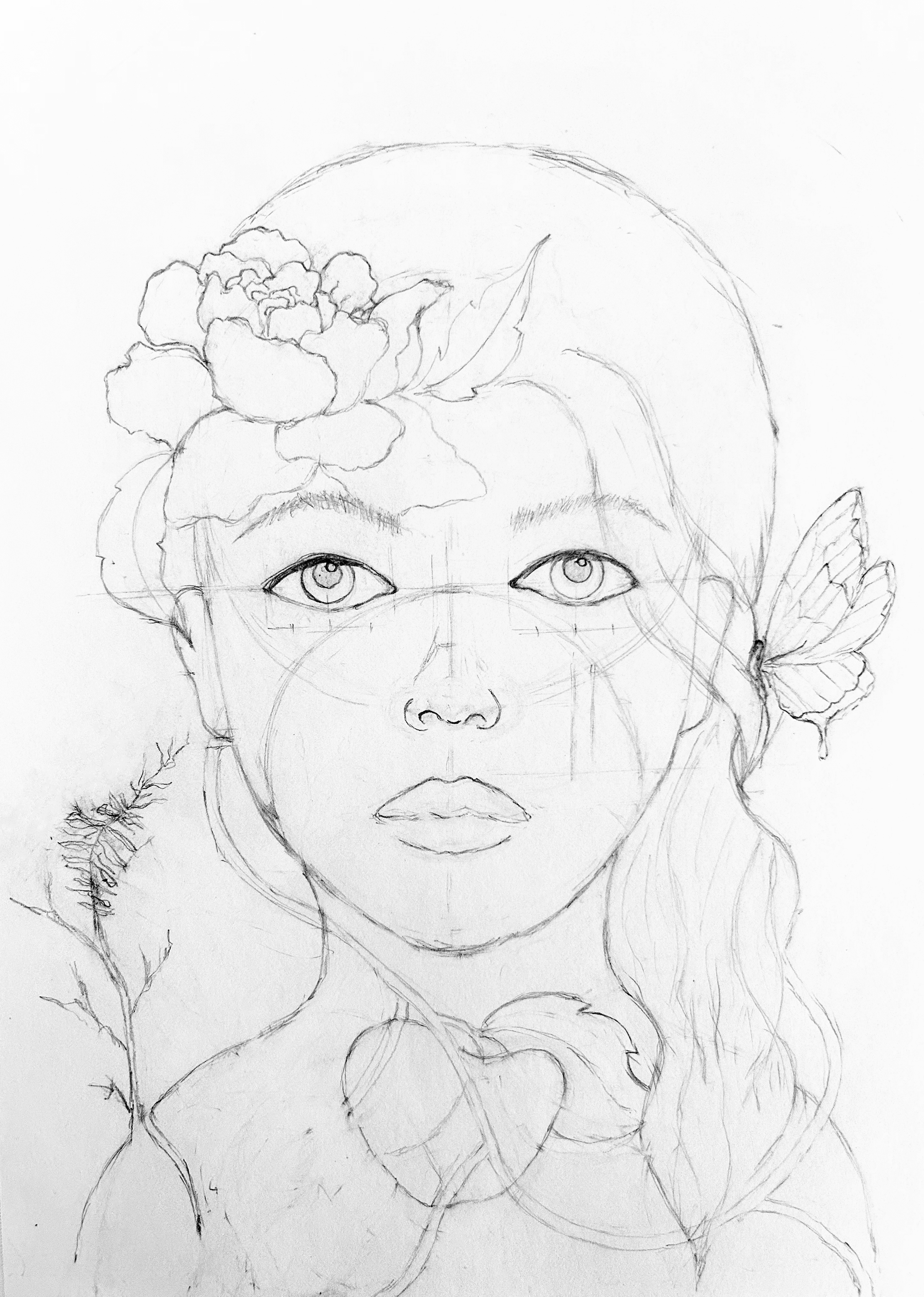
First Sketch
Digital photograph of the original hand-drawn illustration
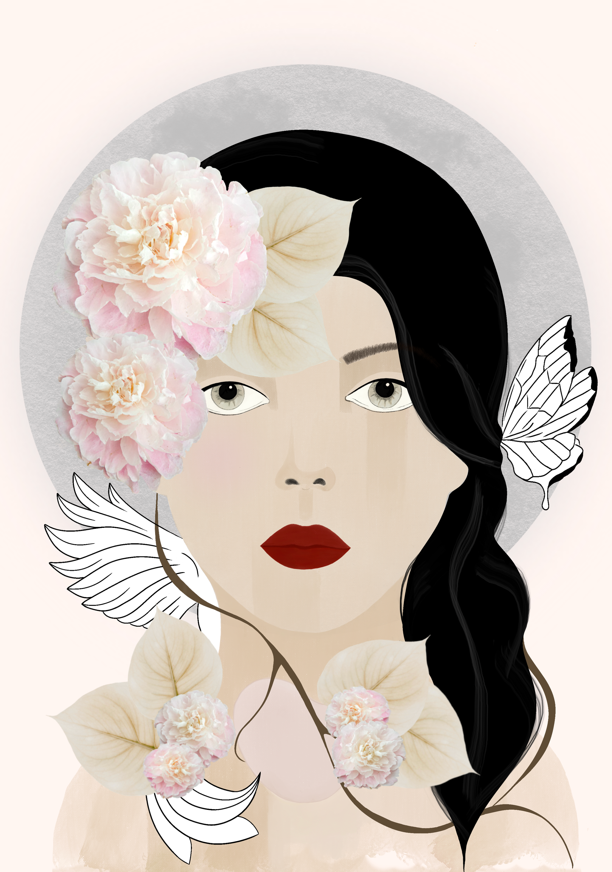
Final Illustration
Mixed-media digital illustration and collage developed in Procreate
Carmela was sketched entirely by hand. She was not traced from any reference. She emerged organically from a shared emotional and visual language between my client and myself. Once she arrived fully on paper, I gently brought her into the digital world, completing the illustration in Procreate and weaving collage elements into the composition. The collage became a meeting of two worlds, the rawness of the hand drawn form and the layered fragments that surround her, symbolizing the integration of different realities. Fragments, memories, and textures come together to support her becoming, echoing the complexity of healing itself. The transition felt less like a technical step and more like an evolution.
The typography on the cover acts as an invitation into a conversation about boundaries, about how much of ourselves we allow others to take. The word Poetry appears large and bold, standing as a declaration of a healing feminine voice, one forged through many inner battles and quiet acts of courage. Its placement close to the top edge of the book intentionally creates a sense of tension, forming an almost uncomfortable barrier that mirrors the lived experience of constraint and pressure. The subtitle, A Means to Healing, moves vertically through the letters of Poetry, like a tear falling downward. This interruption represents pain, grief, and the emotional weight carried through the healing process. A similar treatment is echoed in the author’s name, which rises gently from the bottom edge of the cover, emerging upward as if reclaiming space. The final letters rest softly near the bird’s wing, symbolizing release, tenderness, and the moment where voice meets freedom.
Throughout the process, my client and I worked closely and intuitively. Feedback was not transactional. It was collaborative, respectful, and deeply human. Each revision honored the story rather than polishing it into something distant or perfected.
In the final stages, I made the conscious choice to leave some elements uncolored. This was not an aesthetic decision alone. It was a spiritual one. Unfinished spaces honor the truth of healing. Healing is not linear. It is not complete. We grow little by little, learning as we go. Healing is not a destination. It is a continuous journey.
At first glance, readers are drawn into the cover. The symbolism weaves itself naturally with the title, creating a moment of pause, curiosity, and connection. Inside the book, the illustrations continue, appearing at section breaks to mark new elements of the story. They guide the reader gently forward, offering visual moments of reflection and breath.
Carmela now lives in the world through this book, published by Luna Literary Press and available wherever books are sold. But her impact reaches beyond pages and print. She already carries resonance for readers who recognize themselves in her strength and softness.
This project shaped me as much as I shaped it.
My design practice exists to translate emotion into form, to honor stories that deserve tenderness, and to create visual narratives that heal rather than impress. Carmela reminded me why I do this work. She is proof that when art is created with presence, patience, and love, it becomes something alive.
She remains with me.
And I hope she remains with you too.
Con Amor,
Paola